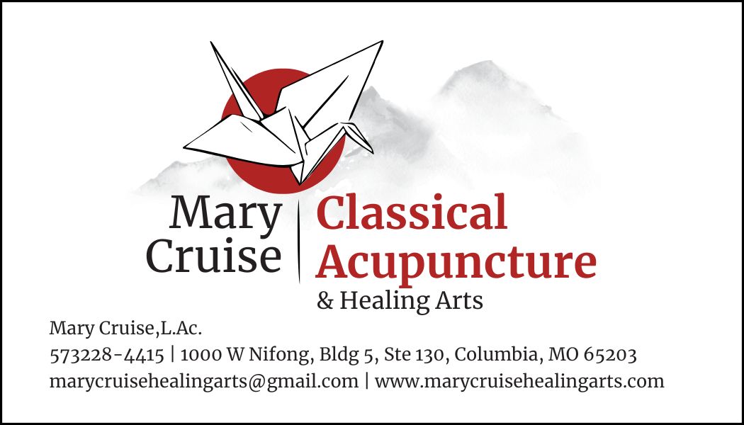
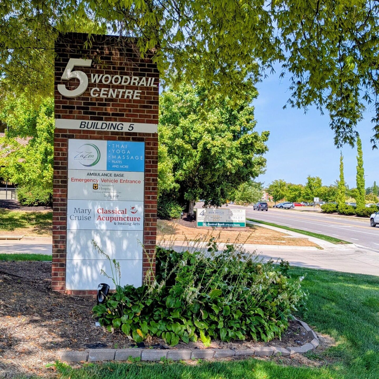
Since Mary’s initial business update in 2013, the business’s services expanded to include more traditional Chinese medicine modalities such as Chinese food medicine and acupuncture (L.Ac). The idea behind the 2025 rebrand was to put acupuncture at the forefront without hiding the other offerings initially offered under the Healing Arts name. The timing also corresponded with moving her office from inside a metaphysical shop into a solo space.
The new logo incorporates a paper crane, which symbolizes peace, healing, and longevity – something she wishes all clients feel when interacting with the business. It also has a deeper meaning to Mary as she folded 1,000 paper cranes as decoration for her wedding. The red accent mimics a traditional Chinese red, a color used in Mary’s physical office, and is a web-safe color.
Programs: Adobe Illustrator, Adobe InDesign